02 Navigation · Accessibility

Google Maps Redesign

Seniors weren't struggling with usability. They were struggling with trust.

51–70 year olds don't stop using Google Maps because it's complicated. They stop using it because they don't trust it. This project explores how landmark-based navigation, reassurance, and explainable system behaviour could make navigation feel safer, more predictable, and more human.

Domain
Navigation · Accessibility
Research
5 interviews · 1 observation session · Adults aged 56–69
Output
Research findings, product strategy, high-fidelity demo
Methods
User Interviews Contextual Observation Trust Reframe 11 Screens Demo
Demo walkthrough
The Question

Most accessibility redesigns start with bigger buttons. This one started with trust.

When I began this project, I assumed senior citizens struggled with Google Maps because the interface was visually overwhelming.

The research pointed somewhere else entirely.

Participants could search for destinations. They could start navigation. They understood the basics. The friction appeared after navigation began. The real problem wasn't operating Google Maps. It was trusting it.

User Research
Who was I designing for?

Not all seniors behave the same way. For this redesign I focused specifically on adults aged 51–70.

Unlike older age groups, they still attempt to navigate independently, own smartphones, and regularly travel to important destinations — hospitals, temples, markets, family events.

They have motivation. They have access. But they experience significantly more friction than younger users.

Research goals
1
Understand how people currently navigate and which tools they trust.
2
Identify where confidence breaks down during a real navigation session.
3
Understand how trust is built or lost during a journey.
Primary Persona
Ramaiah, 58
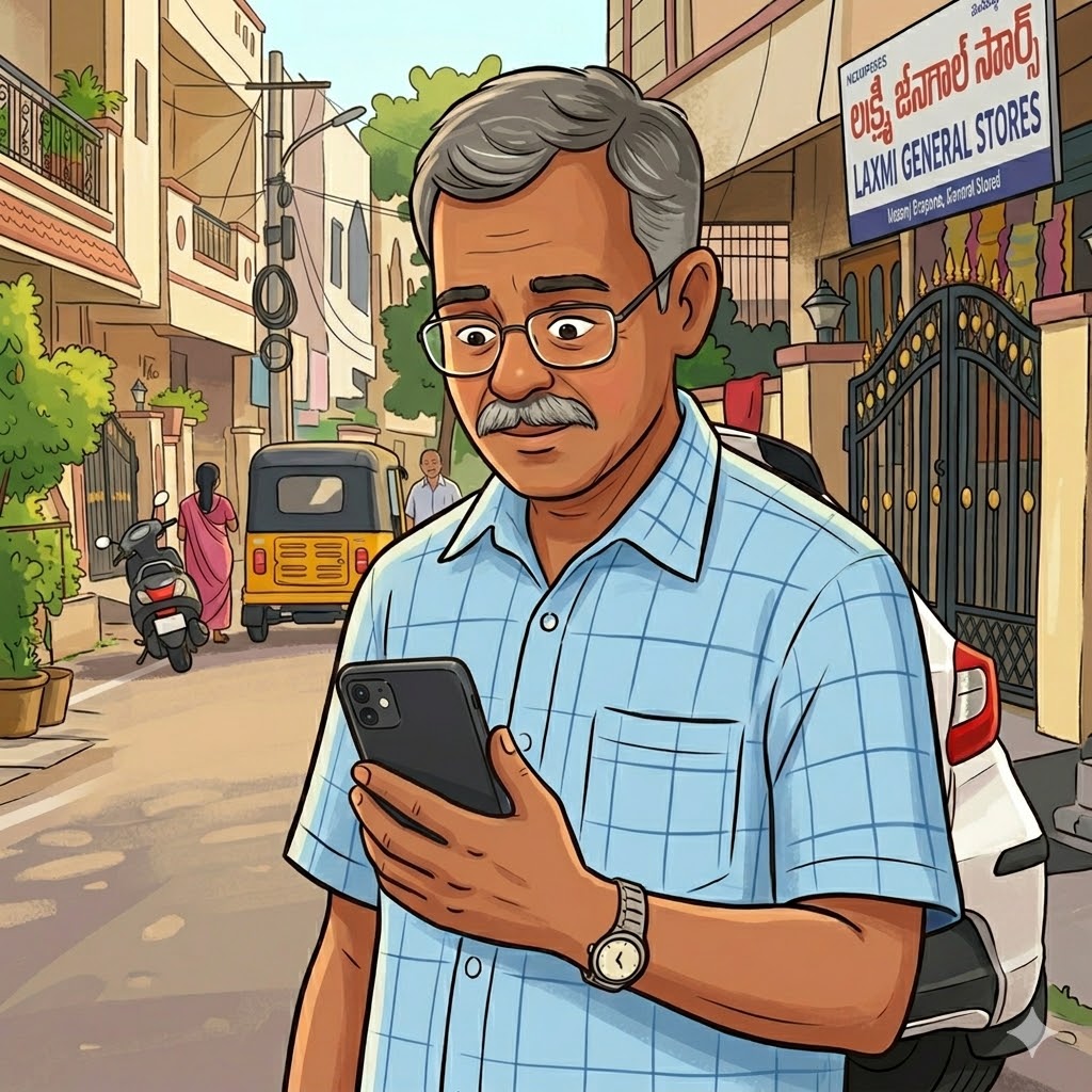
Ramaiah — Primary Persona
Ramaiah
58 · Retired Government Employee · Hyderabad
"What if I get lost somewhere unfamiliar?"
Arrive safely at unfamiliar destinations
Avoid wrong turns
Feel confident throughout the journey
Instructions arrive too late to react
Unexpected route changes feel confusing
Screen feels cluttered while driving
Constant need to check if still on correct route
Research Approach
5 interviews. 1 observation. One clear pattern.

The goal wasn't to generate statistically significant findings. The goal was to identify patterns strong enough to prioritise against.

I conducted 5 semi-structured interviews, 1 contextual observation session, with participants aged 56–69, plus supplementary research across online communities discussing navigation challenges faced by older adults.

Interviews focused on how people currently navigate, where confidence breaks down, and how trust is built or lost during a journey.

Participants
56
P1
Weekly user
Private Employee
58
P2
Monthly user
Homemaker
62
P3
Monthly user
Retired Teacher
66
P4
Rare user
Retired Gov. Employee
69
P5
Monthly user
Business Owner
Research Synthesis
What I observed

Individual experiences varied, but the same four patterns appeared across every interview.

1
3 of 5 participants
Missed Turns Create Anxiety
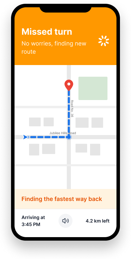
Participants regularly missed turns on unfamiliar roads — not because they misunderstood the instruction, but because it arrived too late to comfortably react while driving. The problem wasn't the route. It was timing.
"Sometimes I realise I've already passed the turn."
2
3 of 5 participants
Route Changes Reduce Trust
Most weren't sure why route changes happened. Several assumed they had accidentally pressed something. The issue wasn't the route change itself — it was the complete absence of explanation.
"I don't know why it changed." · "I thought maybe I touched something."
3
5 of 5 participants
Landmarks Are Easier Than Distances
Every participant preferred landmark-based directions over distance-based instructions. Distance requires interpretation. Landmarks do not. Participants naturally thought in terms of shops, hospitals, temples, and intersections — not meters.
Instead of "Turn left in 200 meters" → "Turn left after Apollo Pharmacy"
4
4 of 5 participants
Users Need Reassurance, Not More Information
Participants repeatedly checked the screen despite voice navigation being active. They weren't looking for new information. They were looking for confirmation — that they were still on the correct route, that the app was still working, that no action was currently required.
"I just need to know I'm going the right way."
Problem Reframe
What looked like a usability problem was actually a trust problem.

All four findings pointed toward the same pattern. At first glance these seem like separate issues. They're not. They are different manifestations of the same underlying problem.

Missed turn
Confusion
Loss of confidence
Constant screen checking
Navigation anxiety → abandonment
Original assumption
Senior citizens struggle because Google Maps is complicated.
What research revealed
Senior citizens struggle because Google Maps doesn't provide enough reassurance during navigation.
Problem statement
Adults aged 51–70 struggle to trust Google Maps during navigation because route changes, turn instructions, and periods of inactivity lack sufficient context and reassurance.
The Insight

Senior citizens don't abandon Google Maps because it gives incorrect directions. They abandon it because it doesn't make them feel informed, reassured, or in control.

This insight changed the entire direction of the project. Instead of asking how to simplify Google Maps, the question became: how do we increase trust during navigation?

Design Principles
Four principles. Every solution evaluated against them.
Reassure
Keep users informed even when nothing is happening. Silence is not neutral — it's anxiety-inducing.
Explain
Every system action should have a reason. Unexplained changes damage trust immediately.
Simplify
Reduce cognitive load whenever possible. Every element on screen must justify its existence.
Anchor
Connect navigation instructions to the physical world. Landmarks, not meters.
Solution 01
Landmark-Based Navigation
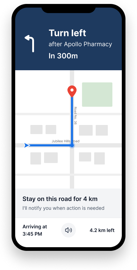
Traditional navigation speaks in distances. Humans naturally speak in landmarks. Distance requires interpretation. Landmarks do not.
BeforeTurn left in 200 meters
AfterTurn left after Apollo Pharmacy
In 400m
Turn Left
After Apollo Pharmacy
📍 Landmark confirmed ahead
[ Map view ]
Solution 02
Reassurance Messages
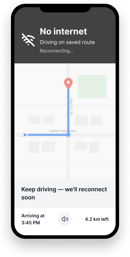
During long stretches of driving, users wondered whether they were still on the correct route. A lightweight reassurance banner continuously communicates status — not new information, just confirmation that everything is on track.
BeforeSilence for 10 minutes → anxiety builds
AfterStay on this road for 4 km. I'll let you know when action is needed.
On Route · No action needed
Stay on this road for 4 km.
I'll let you know when action is needed.
[ Map view — all clear ]
Solution 03
Explainable Route Changes
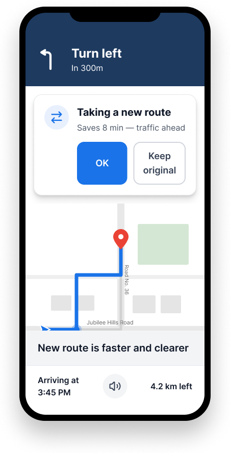
Unexpected route changes damage trust. Whenever the route changes, the system now explains why. The route change remains the same. The understanding changes entirely.
BeforeRoute updated. [No explanation]
AfterNew route selected. Saves ~12 min due to heavy traffic ahead.
⚠ Route Updated
New route selected.
Saves approximately 12 minutes due to heavy traffic ahead on NH 65.
Use new route
Keep original
Solution 04
Simplified Navigation Interface
Every element on screen must justify its existence. Traffic layers, explore tabs, contribution tools, and secondary controls were removed from the primary navigation experience. The result is a calmer interface focused entirely on reaching a destination safely.
[ Focused map ]
Turn left in 500m
After HDFC Bank
Arriving in
18 min
Figma Demo
11 screens across two flows

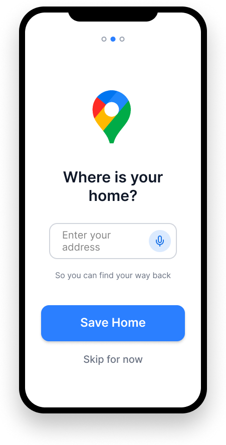
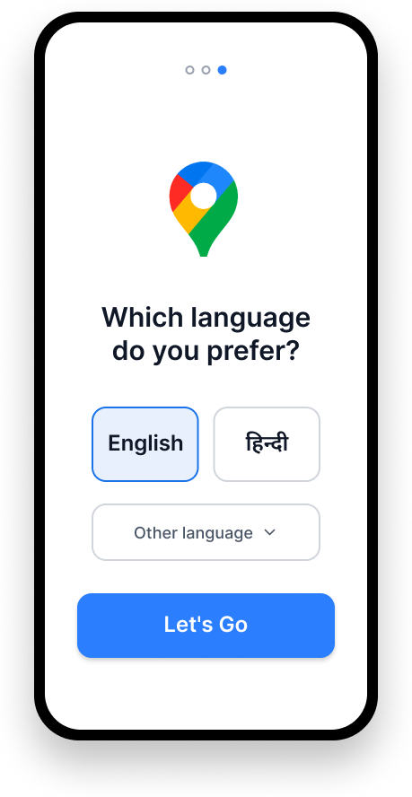
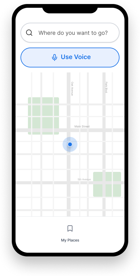
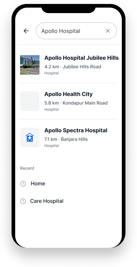
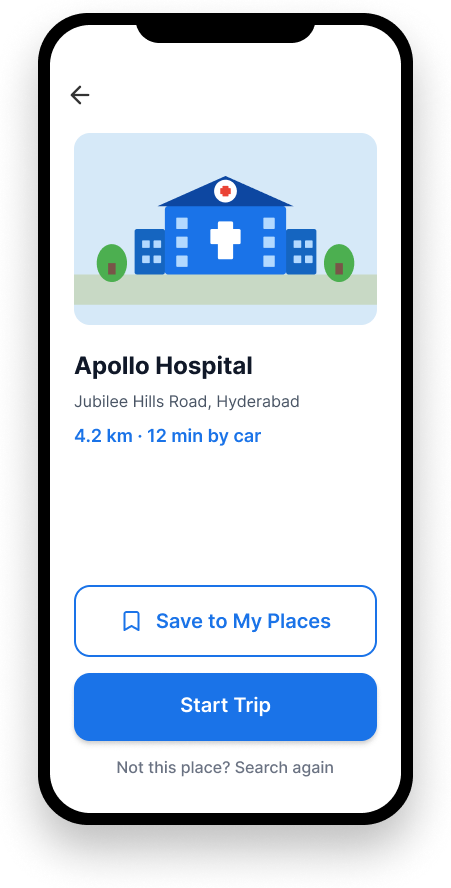
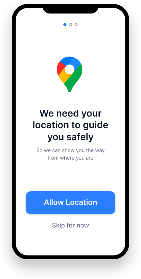
The demo covers onboarding — establishing trust before navigation begins — and the core navigation experience, built around the four design principles.

Flow 01
Onboarding
Onboarding — Welcome
on1.png
ON · 01Welcome
Onboarding — Preferences
on2.png
ON · 02Preferences Setup
Onboarding — Ready
on3.png
ON · 03Ready to Navigate
Flow 02
Navigation Experience
Screen — Home
s1.png
S · 01Home
Screen — Search
s2.png
S · 02Destination Search
Screen — Route Preview
s3.png
S · 03Route Preview
Screen — Navigation Active
s4.png
S · 04Navigation Active
Screen — Landmark Instruction
s5.png
S · 05Landmark Instruction
Screen — Reassurance State
s6.png
S · 06Reassurance State
Screen — Route Changed
s7.png
S · 07Route Changed
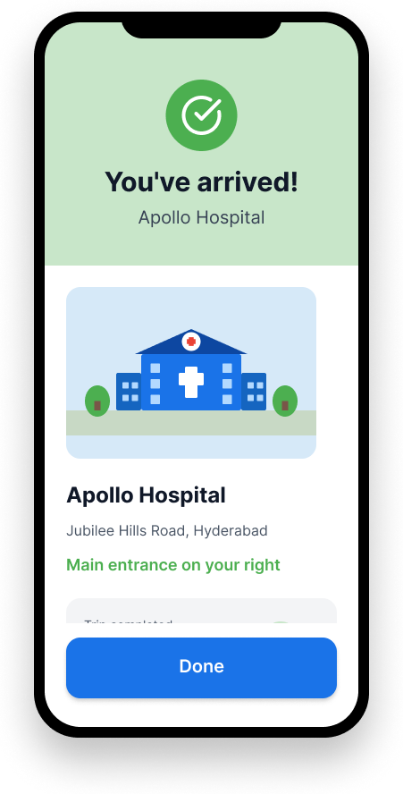
Screen — Arrived
s8.png
S · 08Arrived
Success Metrics
How we'd know it's working
North Star Metric
Successful Trip Completion Rate
The percentage of navigation sessions that reach the destination without abandonment or navigation failure.
Missed Turn Rate
Route Change Acceptance Rate
Search → Navigation Start Rate
7-Day Retention Rate
Closing Reflection
The biggest lesson wasn't about accessibility.
Problem framing is everything
If I had accepted my original assumption, the solution would have been larger buttons and larger fonts. Research revealed a completely different problem. The reframe changed the entire project.
Trust features, not accessibility features
Landmark directions, reassurance messages, explainable route changes — none of these are accessibility features. They are trust features. And that distinction matters for the product strategy.
Silence is a design choice
The biggest insight from the observation session: users checked their screens repeatedly not to get new information, but because silence felt like failure. Designing for quiet moments is as important as designing for action.